CarMax Color System: Part 2
Understanding the Need for Change
In 2015 when the old color system was made, there wasn’t a lot of consideration for accessibility. Overall the website became more cohesive under this system but it lacked the option to explore with accessible color combinations. In this section I’ll walk you through why the old color system didn’t have many accessible combinations, our first breakthrough in research for the new color system, and where the new system landed when it comes to combinations.
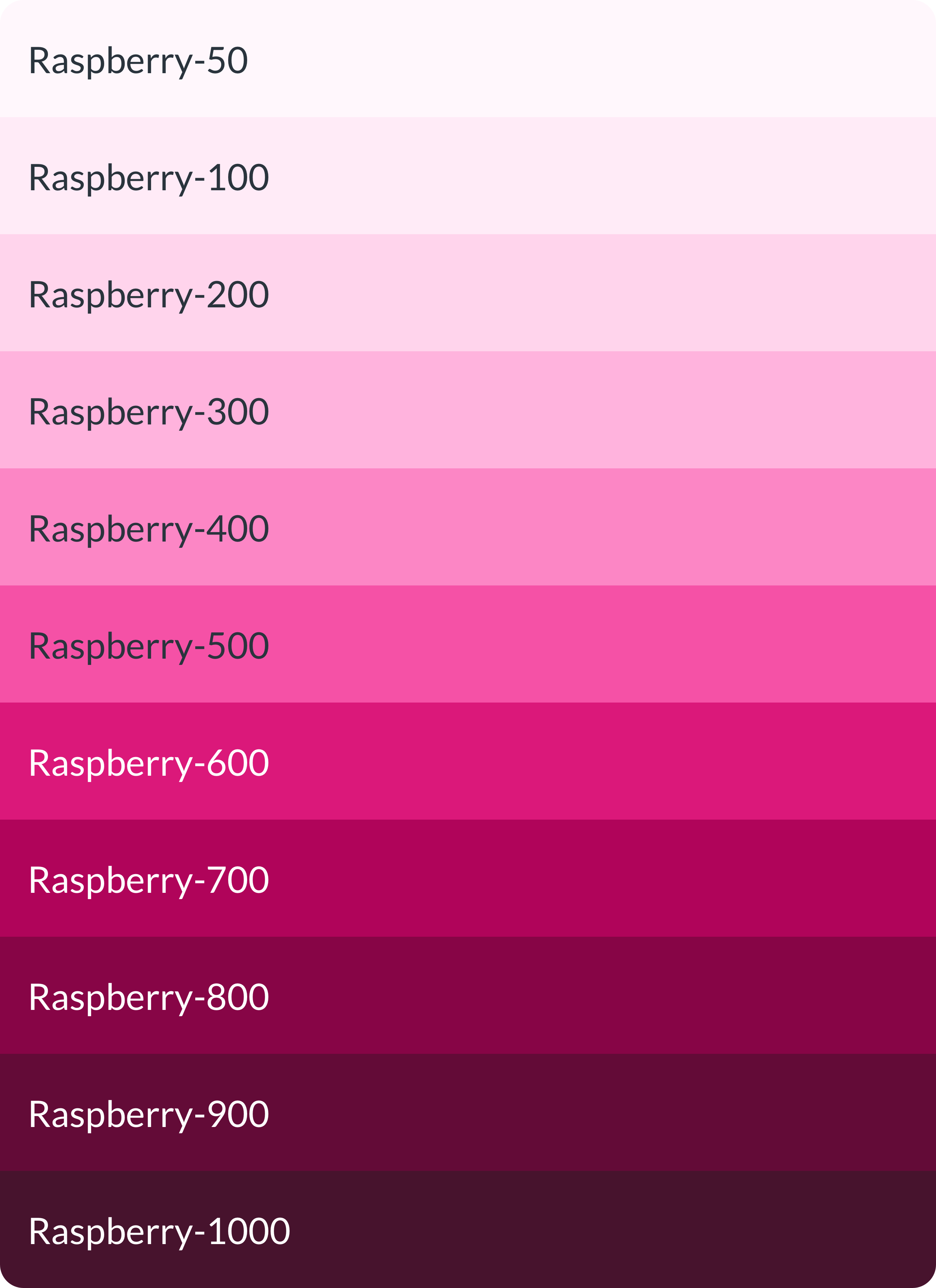
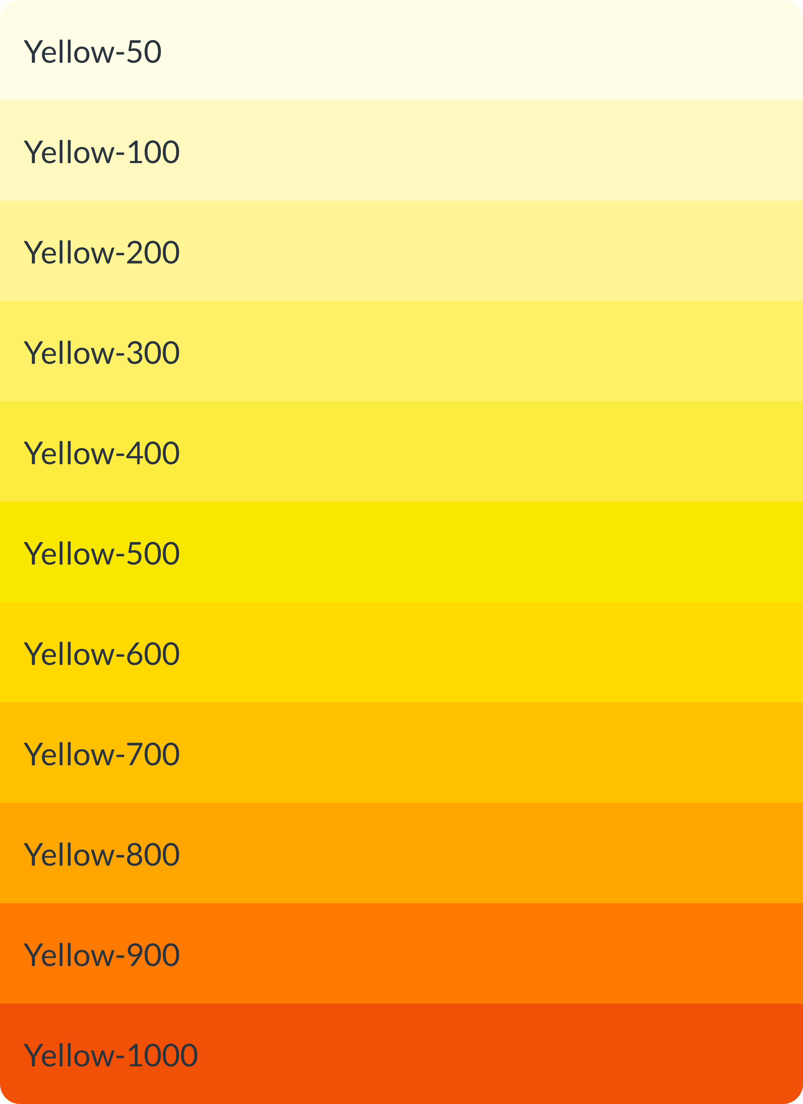
Here are the old color system’s swatches next to the new color system’s swatches to show off the change.
Glossary of terms
Color value:
A singular hex code, RGB combination, HSV combination, or CIE-Lab combination. Examples include: #003366, RGB (0, 51, 102), HSV (210, 100, 40), CIE-Lab (21, 7, -34)
Color family:
A collection of color values that share similar hues. Examples include: KMX Blue, KMX Yellow, Cyan, Green, Slate)
Color ramp:
The term used to collectively refer to all color family’s individual 50, 100, 200, 300, 400, 500, 600, 700, 800, 900, & 1000 values. For example the 100 color ramp is Color System 1.0’s lightest values while the 50 color ramp is Color System 2.0’s lightest values.
L*-value:
The term used to represent the Lightness value (integer number in the range 0 to 100) from the CIE-Lab color mode.
The Unseen Problem
Below are the swatches from what I’ll now call Color System 1.0. Take special note of the similarities or differences between the color ramps of each family .
“If you hover over each palette, it will show you what the color is once converted to its L*-value.”


“Once they are all put together, the differences become very obvious.”
In most cases, this wouldn’t be an issue but for what Color System 2.0 was aiming for, it was one of the biggest issues. What we didn’t know at the time was how important the color ramps were to accessible color combinations.
Where the Problem Left Us
The lack of cohesion between each color family’s ramp gave us an extremely scattered color combination chart. The system had a disproportionate amount of accessible color combinations across each family. Luckily, when looking at the L*-value chart above and the accessible color combination chart below, we had our first find. The lower or darker L*-values had more color combinations with the higher or lighter L*-values. Though it may seem obvious, it helped us understand this one fact:
“Across the entire hue range there is a correlation between the L*-value of a color and accessible color combinations.”
This chart shows which color combinations from Color System 1.0 pass WCAG color contrast AA at 14pt type size.
Where Our Solution Took Us
Jumping ahead to Color System 2.0, this is the new color combination chart. The color system’s rework had one main approach, create an evergreen system that has accessibility top-of-mind. I’m happy to say that for the most part the system achieves this goal, with the exception of our new Yellow family but I will explain in the next section.
This image depicts which color combinations from Color System 2.0 pass WCAG color contrast AA at 14pt type size.
The Hidden Secret
Just like above, here is Color System 2.0’s color families with the hover state being the L*-value of each color.


Putting them all together shows the reason we were able to achievable a mostly symmetrical color combination chart. In the next section, I’ll explain what decisions I made in order to achieve this.

