

2019 CarMax Car Details Page
In the summer & fall of 2019 I collaborated with a Principal Product Design on CarMax’s car details page. This page houses vehicle history information, photos, price point, and the list of features & specifications. It is a crucial page to help customers progress further down the funnel.
“My role over the next few months was aiding with discovery, designing new layouts, creating wireframes, & providing animations to show ideal interactions.”
The Problem
When the quarter kicked off we had a two-fold plan for iterations on the page. The current state of the page was not on par with our new visual design system & was not optimized for the new 360º photos initiative that would launch soon. Our hypothesis was that if we restructured the page so that more images & information could be consumed at the same time, we’d see an increase in customer progression.
In 2019, car details were shown in one long page with valuable information below the fold. This led to users scrolling down for key features & key specifications then scrolling back up to re-review photos & price point.
Analyze the current page
The work began with slight design changes and a full analysis of top customer interactions on the page. Using fullstory & Adobe Analytics I created a heat map to help the team understand what customers were doing within the first minute of being on the page. This helped create the hierarchy of information that we’d use with the new layout.
“The map gave great quantitative data but we needed user interviews & exercises to understand the Why behind their behaviors.”
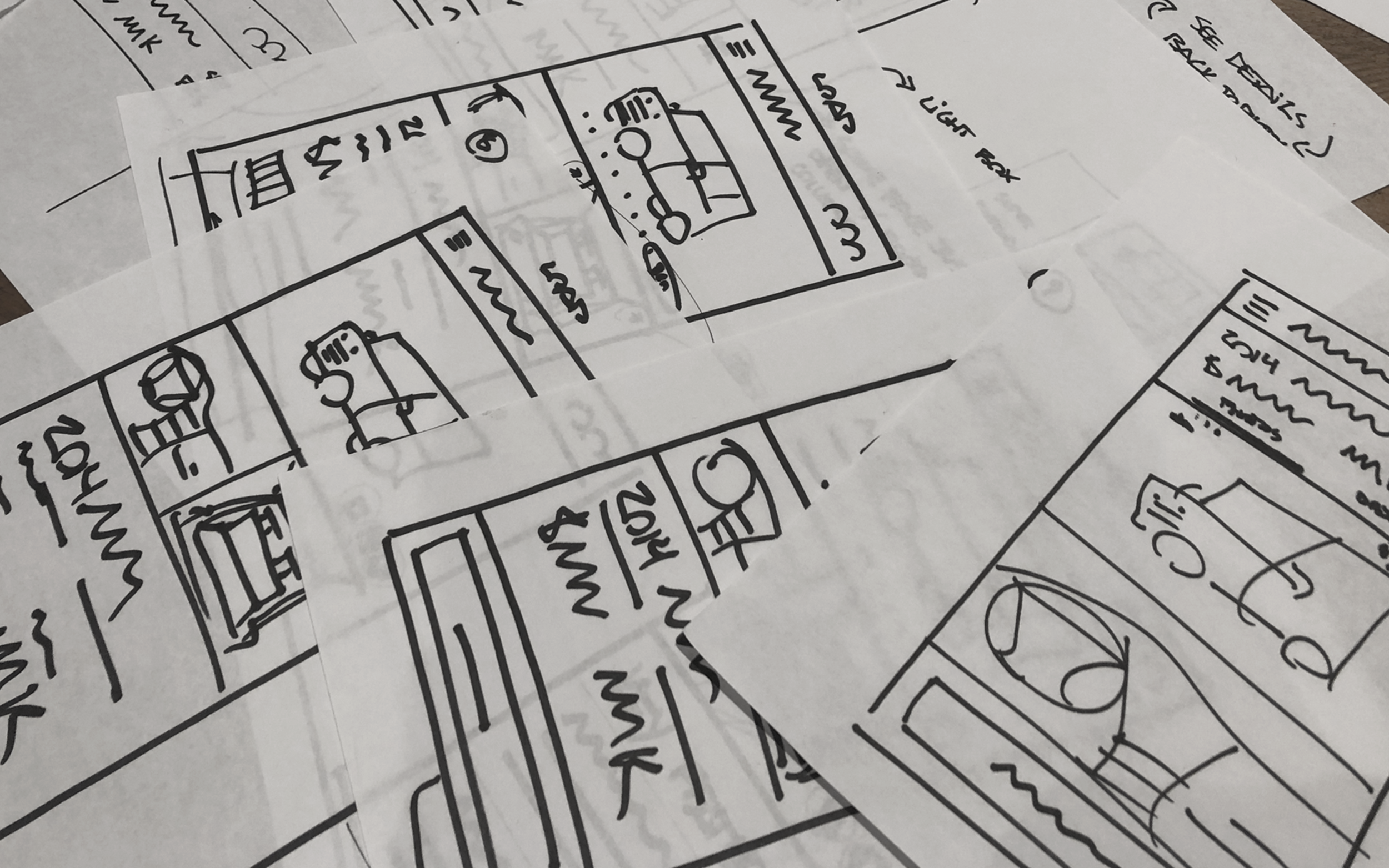
Discovery & Sketching
We started digging into the problem by asking users to walk us through their process of car searching and what was going through their head. During the interviews we would ask “What do you look at right way?'“ and “What’s a non-negotiable?” or “What are you willing to sacrifice for the right car?”. With these questions we were slowly building a mental card sort to understand what was the most important to least important information for customers. In between our weekly discovery sessions, I held sketching sessions with other designers to get inspiration and input.


This image shows how our hierarchy of information had to change between tests to accommodate user feedback. Key features & key specifications needed to be much higher in the page.
Main Discovery Findings
Separate exterior & interior photo galleries may help users get to the photos they want faster.
A dual scroll layout on desktop will allow customers to keep photos & valuable information on the screen at the same time.
If a vehicle doesn’t have the right features, it can make or break a customer’s decision. In other words, they’re more flexible on final price than they are on the vehicle having Apple Play, heated seats, or whichever feature they want most.
Iterate, Iterate, Iterate
With this information, I created potential page layouts for desktop and mobile. The whole time I was iterating I was constantly checking what was above the fold and what could go below. I tried different image crops, column widths for content, & the order of some of the key photos.
This Miro board shows the main design iterations & miscellaneous specs throughout the project.
Animatics for Interactions
Desktop Animatic
In-between iterations, I created animatics to help the developers understand how the scroll interactions should occur. It was a great way to help the team and stakeholders grasp the vision of the finished product. The desktop animatic was fairly close to the MVP so we were able to deliver what we promised.
Mobile Animatic
A few weeks into this project we realized that mobile needed an entire redesign. The functionality we were aiming, shown in the video below, was not possible with the resources and time we were given. Luckily, with the sketching sessions I held previously I had more than enough alternative designs to explore.
Desktop MVP Designs
View 1 / This is the car details page looks like upon load. As stated earlier, careful consideration was taken when deciding what would be above the fold.
View 2 / This shows the key photo labels for the gallery section & the financing information for the vehicle.
View 3 / At the bottom of the gallery section we show two carousels with recommended vehicles so the user can naturally pivot to other options.
Mobile MVP Designs
View 1 / Mobile above the fold information was crucial. We decided to go with the same information that would be on the Search Results page so users knew they were on the correct page.
View 2 / This shows off key information that customers ask for frequently & several important CTAS.
View 3 / Since the photo gallery is different on mobile, we highlight the photos of key features for easy scan-ability.
Personal Learnings
After working on a true product team I brought back a lot of my learnings to the Visual Design Systems team. I learned how hard it is to balance a user-centric experience with accessibility first thinking, all while trying to stay consistent with the rest of the organization. I came back with a mentality of more flexibility of the system and encouraging designers to seek their own definition of “consumption” when it came to the Design System.
The Results
Decrease in interior 360º usage
Increase in customers applying for financing on page
Decrease in time spent on page
No harm to overall leads
Unable to identify what design choices caused which results