CarMax Search Page
2019 CarMax Search Page
The search results are one of CarMax.com’s “front door” pages which means we are constantly refining and iterating the design. During 2019 the page needed to start aligning with the 2.0 version of our Design System so the team in charge asked for my help updating the designs.
“My role on this project was lead visual designer in charge of making sure all designs were up to our own quality standards and followed accessibility guidelines.”
Auditing the Current Site
Because this was the first large scale application of the new design system, I made sure to document any major iterations for future showcasing. The design changes from 2017 to 2018 were done without the aid of a visual designer therefor much of the 2019 process was transitioning everything to the new system.
2017 Desktop Search Page
2018 Desktop Search Page
2019 Desktop Search Page
2017 Mobile Search Page
2018 Mobile Search Page
2019 Mobile Search Page
Starting with the Grid
I started the transition by looking at the page strictly from a grid perspective. I wanted the design to be responsive because we deal with so many different screen sizes but optimized based on the user’s device.
I created static comps for the TV, monitor, desktop, tablet, and mobile screens to help developers understand how the designs will scale up and down. Later in the process I animated these transitions to help the rest of the organization appreciate why we need to design for more than just desktop and mobile.
“Key changes per breakpoint were vehicle tile size & orientation, persistent or temporary drawer, and which form fields were exposed.”
Animation of the responsive grid in action
Refining the Filter Experiences
Desktop Filter Pills
The filter pill bar was a new feature that was meant to help users get to the most used search terms faster. For the transition work, it was as simple as relegating the color to slate, rounding the corners, and having the applied filters appear in-line. These design changes were done to help with how busy the top of the page was.
Side note: By the time this project was happening, the global header had changed.
“Recommended to apply” animation
Mobile Filter Drawers
The mobile filter drawer needed a usability overhaul. The 2017 redesign had several accessibility violations: no visible checkboxes for list items, sliders did not have accompanying form fields, text colors did not meet contrast requirements, and in some cases there were tabs within tabs. Because of how utilitarian this section was, I stripped out much of the custom selection components and went to the basic Material Design form fields where applicable. We knew there were chances for surprise and delight throughout the browsing process but this was not one of them.
Mobile filter drawer animation
Exploring Compare Mode
The current compare mode feature was underutilized and needed user discovery to better understand the problem. We had already validated the need for the feature but once implemented we weren’t seeing the interactions we expected. Through interviews and analytics we found that saving a car (heart icon) was a different mindset than comparing a car (check icon).
“To reinforce the customer switching their mindset we decided to have a switch component activate compare mode”
Compare Mode on desktop experience
Updated Components
This project led to some updates of existing components in our design system; here’s a showcase.
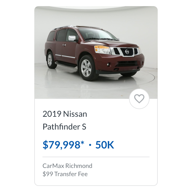
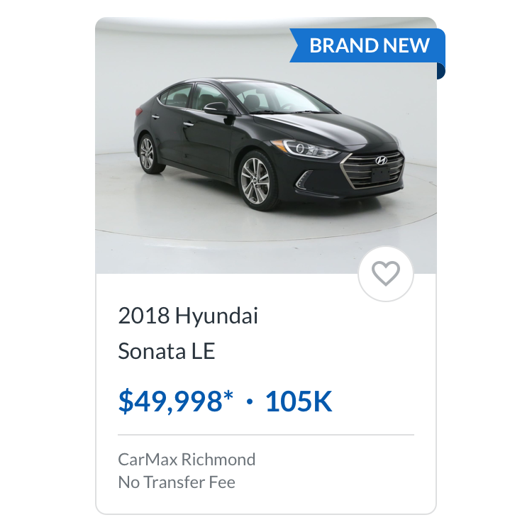
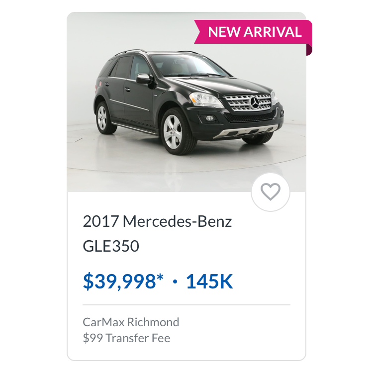
Vehicle Tile
Default
Brand New
Coming Soon
New Arrival
Favorite Icon Button
Inactive
Inactive Hover
Active
Active Hover
Compare Icon Button
Inactive
Inactive Hover
Active
Active Hover
Car Type Tile
Inactive
Active
Disabled
